Corporate Identity
HDC Hyundai Development Company’s CI symbolizes the harmonization of softness and tension, emptiness and fullness, straight lines and curves based on a geometric framework.
-
Flexible innovation
It symbolizes a changeable and scalable design system based on creative and innovative corporate culture.
-
Expertise in spaces
It symbolizes HDC Hyundai Development Company creating a foundation and living spaces with its own expertise and insight.
-
Robust reliability
It presents the corporate image of reliability and leadership in the industry through basic principles of clarity and simplicity.

- *The logotype design, including its colors and sizes, may not be altered or reproduced partially or arbitrarily in any other forms.
- * Using the original (digital) file without any changes or modifications ensures that the identity of HDC Hyundai Development Company is well maintained.
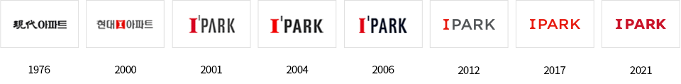
Brand Identity
IPARK is a premium space brand changing the expression of cities, instead of merely being a residential area or commercial facility. The space of IPARK targets to make the lives of customers and the things located within the space more beautiful and to ultimately bring happiness. A beautiful space and considerate space that emits more light as time goes by and as life goes by is pursued, by clearing away the luxurious title and flashy rhetoric.
Changes of IPARK symbol